 |
|
| Manual |
|||||
The Beginning • Overview • Getting Started HammerKit Tools • The Component Editor • Understanding Component Types Component Templates Creating Content Component Advanced Component Setings • The Style Manager • Working with Styles & Colors Creating a New Style Adding a New Color • The File Manager Folder Actions File Actions • The Keyword Manager • Settings Manager • Data Manager Creating & Using Data Entering Data Output Data Elements HammerKit Elements • Creating Content with Elements • Adding text • Adding Images • Cut, Copy & Paste User Manager • Defining Users, Groups & Access Rights • Adding groups • Removing Groups HammerScript • Syntax • Constructors & Variables Scopes |
Component Templates
What is the default template?
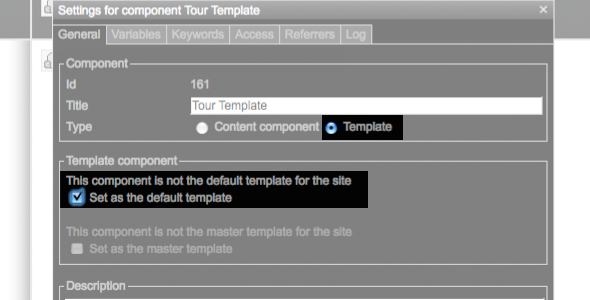
You can choose one of the component templates as the default template. This template will be automatically used by all content components you create, unless you specify that they use another template. This feature allows you to change the look and feel of your entire site by just changing the default template. Create a new component + Open the properties box for the component by right- clicking the name of the component and selecting properties + Type a name for your component then set the Type to ʻTemplateʼ. This will display the template settings. + Finally, check the box that says ʻSet as the default templateʼ When using a template component, you will need to add a place holder that marks the area where the content will be shown. This is done by adding a Component Include element onto the template. This defines the position of the main content area and will be the place in your template where any content component you ask for is displayed. The process of adding elements is described further on part ‘Adding elements to components’. |
Product
|
Company
|
Community
|
Awards
|
|||||||||||||||||||||||||||||||||||||||||||||||||||||||||||||||||||||||||||||||


